
Nonprofit Rebrand + Website Redesign
Zehud is a nonprofit organization that provides high-level Hebrew and Jewish cultural education to children throughout Europe and beyond. To increase enrollment and donations, they needed a fresh new look for their brand and a more functional and impactful website that brought their magic to life.
What We Were Going For...
Fun and engaging
Clean design
Clear benefits
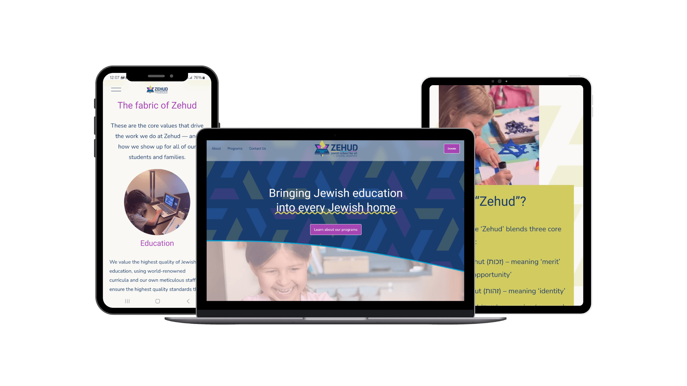
We created a logo that encapsulates Zehud’s essence. There’s a Hebrew letter zayin (ז) — for Zehud — in the center of a laptop, arranged and tied together with the shape of a Jewish star. The colors are bright, vibrant, and fresh, and the base pattern carries through the geometric nod to the Jewish star in the logo.
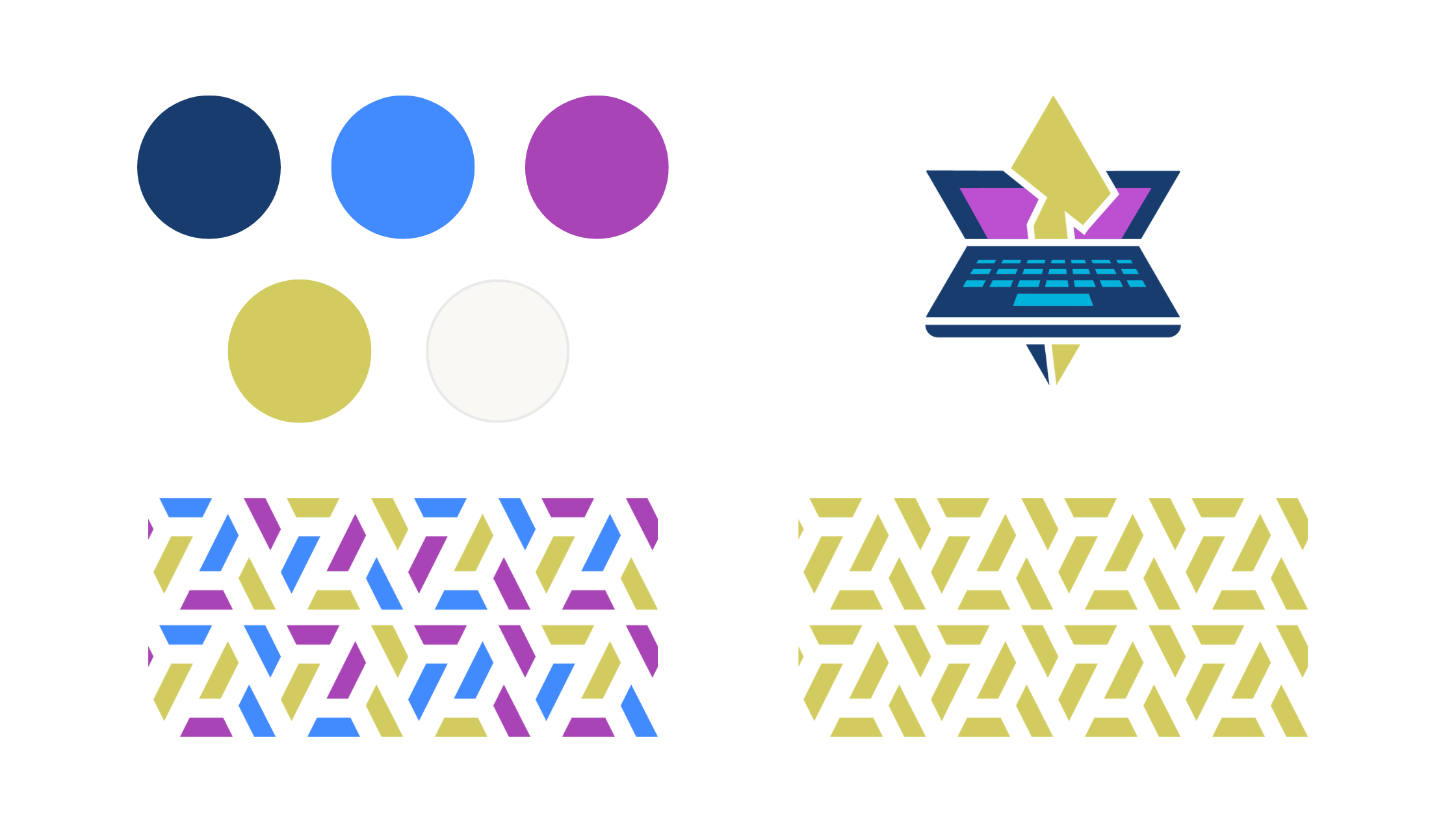
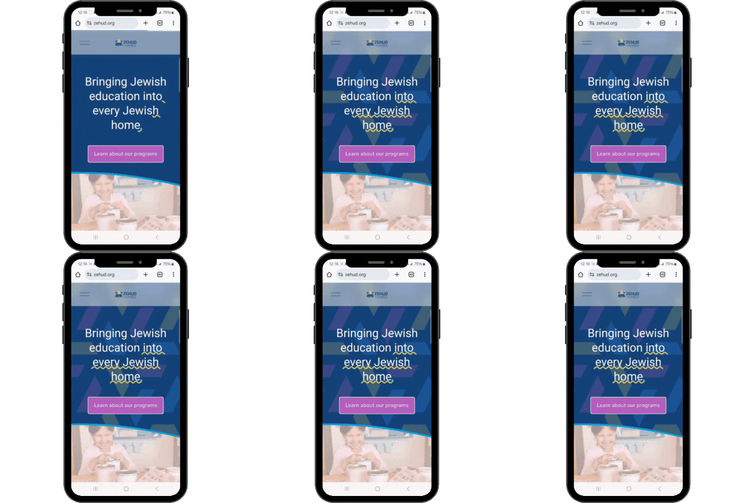
Building on our strategic new brand, we built a website that WOWs.
Their previous website left users confused about what Zehud does exactly, and what actions Zehud wants them to take. With our redesign, we leaned into clear and bold statements and calls to action, to drive the user toward the right actions.
Zehud’s core identity pillars — Education, Access, Trust, Joy, and Community — are clearly spelled out on their about page, but they also come through clearly across all messaging on the website.
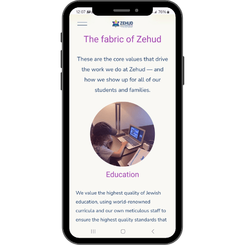
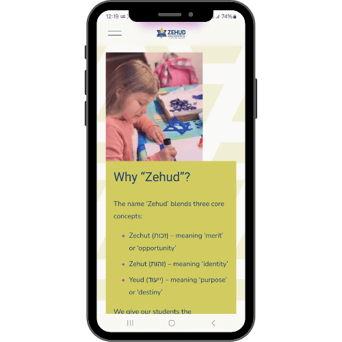
The website is full of vibrant colors and movement that speak to a childlike wonderment, while still looking clean and professional. We highlighted pictures of the children first and foremost, since they are the real reason Zehud does this important work at all.
Ready to take your brand to the next level?
Interested in working with us on growing your business? Set up a free 15-minute vibe check:
